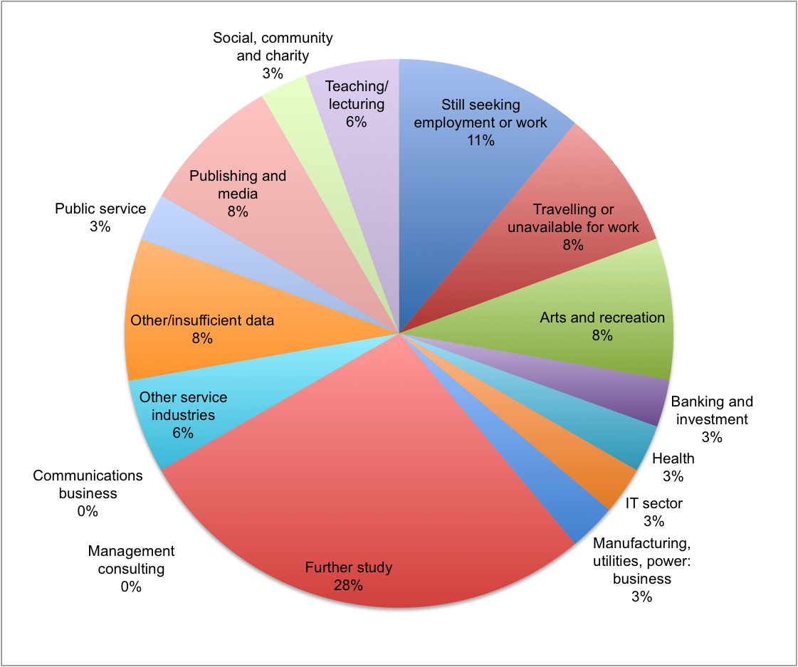
 Suppose you wanted to create an infographic that showed the occupations of people with a particular college degree. One simple and clear way to do this is with a pie chart like the one to the right which shows the occupations of people who received a degree in philosophy from Cambridge University. This is an example of a one-to-many mapping where one factor (a philosophy degree) is mapped or linked to many possible other factors (the occupations). Pie charts are especially good at depicting one-to-many mappings.
Suppose, however, that you wanted to create an infographic that showed how a variety of different college degrees are linked to a variety of different occupations. This is called a many-to-many mapping. Pie charts don’t work as well for this because you need a separate pie chart for each different college degree. If you want to present information about a lot of different college degrees, the number of pie charts you’d need would become tedious and possibly confusing for your audience.
The people at the US Census Bureau came up with an elegant solution to this problem with the interactive infographic pictured at the top of this post. The infographic maps 15 categories of college degrees into 20 occupations. For each degree it gives a graphical representation of the proportion of people with that degree that move into each one of the occupations.
The infographic is focused on Science, Technology, Engineering and Math (STEM) majors and occupations. There are three basic variants of the core infographic: one for all majors, one for STEM majors, and one for non-STEM majors. Majors and occupations are listed around the outside of the circle and mousing over the name of the major shows where those majors are employed while mousing over the occupation shows which degrees feed employees into the occupation. Tabs along the top of the graphic allow you to break the data down by gender or ethnicity.
Follow this link to play with the infographic. It can be a bit confusing at first but all it takes is a minute of playing around with it for it to become clear how it works.
There is an extraordinary amount of information packed into this one infographic. Whether or not you’re interested in where people with different college degrees are employed, this type of infographic provides an elegant solution for graphically illustrating any kind of information that involves many-to-many mappings.