Paraphrasing the philosopher Immanuel Kant, good data without a good infographic is blind, a good infographic without good data is empty.
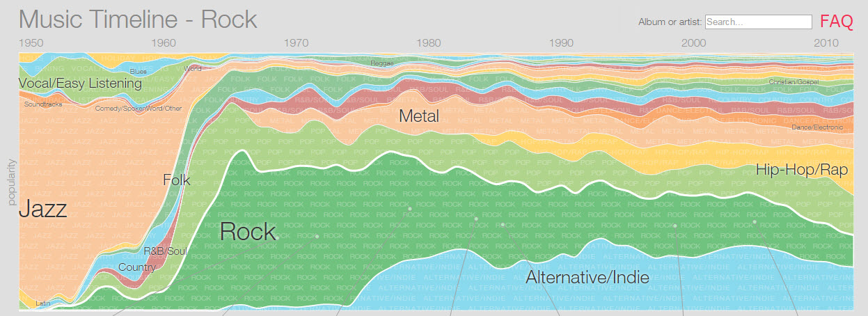
The Music Timeline is a multi-layered, interactive infographic developed by Research at Google that is beautifully designed to illustrate the popularity of different musical genres at different times.
There’s good news and bad news here.
The good news is that the infographic is a terrific example of what you can do with a well-designed area chart. The color bands represent different genres of music. Time from 1950 to the present is graphed along the x-axis and popularity is graphed on the y-axis. The relative popularity of a particular genre of music at a particular point in time can be shown by the thickness of the bar that represents that type of music at that point in time. For example, according to the chart it appears that Rock music was the dominant genre from 1970 to 1980. It also appears that beginning with the rise of Alternative/Indie music in the mid-70s the popularity of Rock declined relative to other types of music until it fell behind Alt/Ind, Hip-Hop/Rap and Pop (the light green band right above Rock) in recent years.
Many color bands that represent different genres are too narrow to label without cluttering up the graphic. This is especially true for recent years with the growth of genres like Dance/Electronic, New Age or Christian Gospel that did not exist around 1960. Mousing over the chart pops up a label for each of these narrow genres. I counted 21 genres of music charted for today as opposed to 7 charted for 1950.
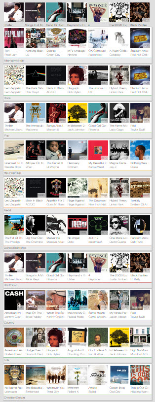 Below the chart is an array of popular album covers. Each row in the array represents a different genre. When you mouse over a genre in the main chart, the row for that genre pops up to the top of the array so that albums from the genre you’re looking at are always visible right below the chart. Smaller genres that are not present in the 11-row array are also associated with their own sets of popular albums and a row for each of these smaller genres will appear at the top of the array when you mouse over the small genre in the main chart.
And that’s just the surface layer of the Music Timeline. Clicking on a genre brings up another graphic showing sub-genres within the genre you chose. This new chart follows the same design and uses the same mechanics as the main chart . Here’s an example using the Dance/Electronic genre.
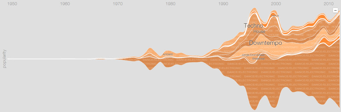
The area of the chart below the horizontal midline is a mirror image of the area above the line. The area below the line shows the popularity of the genre as a whole; the area above the line shows the relative popularity of each of the sub-genres that are listed in the chart. In the Dance/Electronica chart it appears that Downtempo rose rapidly in popularity starting around 1990, started to fall off in the early 2000s, and then reached a point where it more-or-less held steady beginning around 2007 or 2008. Below the graph you’ll find an array of albums with a row for each of the sub-genres. The array works just like the array for the main chart; mousing over a sub-genre pops a set of albums associated with that sub-genre to the top of the array.
Finally, there’s a third layer to the Music Timeline. Clicking on a sub-genre in the chart brings up a chart of artists associated with that sub genre. Here’s the Techno chart that is nested in the Dance/Electronic chart.
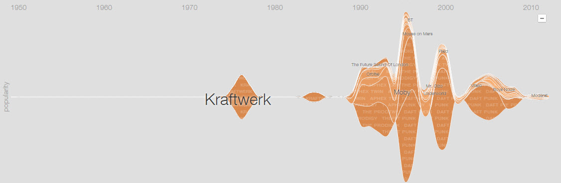
The area below the horizontal line shows the popularity of the genre at a particular point in time and the area above the chart shows how popular individual artists were at different points in time. Again, mousing over an artist brings up an array of that artist’s popular albums below the chart. Clicking on an artist brings up a screen with some info about the artist coupled with links to buying the artist’s music on Google Play.
The Music Timeline is very well designed to show a wealth of information about musical genres, sub-genres and artists. The multi-layered design allows users to delve as deeply into the subject as they wish and the fact that each layer has the same structure and uses the same mechanics makes the infographic easy to understand and use.
That’s the good news.
Now, the bad news.
Whether you’re looking at a simple line graph or a powerful interactive infographic like the Music Timeline the most important aspect of what you’re seeing is the data. If the data are flawed, contaminated, biased or unreliable, you’re looking at a fancy representation of information that is useless at best and highly misleading at worst.
This is where the Music Timeline runs into serious trouble.

 Billboard, the RIAA (Recording Industry Association of America), and the IFPI (International Federation of the Phonographic Industry) are among several organizations that have decades worth of data cataloging music sales both in the US and around the world. Did Research at Google make use of these resources when making their chart?
No.
The data in the Music Timeline comes from Google Play Music. Research at Google measured the “popularity” of an album or artist as the number of Google Play Music subscribers who have that album or artist in a playlist.
One consequence of the choice to use appearance on playlists as a measure of popularity is that it makes the timeline aspect of the chart completely misleading. Looking at the Music Timeline you are naturally led to think that the chart is giving you information about what music was popular at some point in time. For example, if you look at the decade of the 1960s on the chart, you are likely to think you are being shown information about what kinds of music people liked in the 1960s. That’s not at all what the chart is showing you. What you are seeing is a relative ranking of the genres, sub-genres, artists or albums from the 1960s that are in the playlists of people who subscribe to Google Play Music today. There is no information in this infographic about music from past decades that was popular with listeners during those decades.
Another consequence of the choice to use appearance on Google Play Music playlists as a measure of popularity is that the information presented in the Music Timeline is likely to be highly biased. In order to get reliable information about the popularity of different types of music among people who listen to music you have to have a sample that is representative of the people who listen to music. (For more on representative samples see Critical Thinking: How Reliable are Conclusions Based on Social Media Data?).
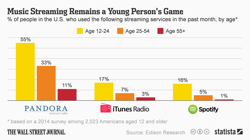
How many people subscribe to Google Play Music? Google isn’t saying. What is the demographic profile of these subscribers? Google isn’t saying. Are Google Play Music subscribers representative of the general population of people who listen to music? Almost certainly they are not. Why? We don’t have any specifics about Google Play Music subscribers but we do have information about music subscribers in general drawn from a collection of subscription services like Spotify, Rdio, Pandora etc. For one thing, most music subscribers are between the ages of 18 and 35 with the peak at about age 21.

As can be seen in the chart above, different age groups have markedly different tastes in music. Accurate and reliable information about the popularity of different musical genres demands a sample of music listeners that is balanced proportionally by age group for listeners of different ages. Although it’s possible, it’s highly unlikely that Google Play Music subscribers form this type of sample.
 Note also that the chart above reflects the tastes of music listeners in different age groups that subscribe to various music services. Music streaming is growing in popularity at a very rapid rate but as of October 2014 Nielsen reported that less than half of US music listeners identified streaming as their primary source for music. Given the age bias that exists in the population of streaming subscribers it’s highly unlikely that a raw sample drawn from playlists of any subscription service will provide useful information about the musical tastes of the population of music listeners.
 What can we conclude about Research at Google’s Music Timeline? As a tool for presenting information about changes in musical tastes over time it’s brilliant. An area graph is a good choice for this type of data and the mouse-over plus click-down mechanics that are implemented in the chart provide an excellent and intuitive way to drill down into more refined information about musical tastes and genres. Outstanding.
 The tool is terrific. How was the tool used? When it can be shown that the information you’re given is flawed or unreliable it’s tempting to think that it may not be perfect but it’s probably good enough. This is a temptation that it would be good to avoid. Flawed data tells you nothing. It may be accurate and it may not; there’s no way to tell. Even more important, relying on bad data, even when you are aware the data has problems, can give you the feeling that you are informed about something when you are not. As a source of information about how musical tastes have changed over time or as a source of information about the musical tastes of the population of contemporary music listeners the Music Timeline is worthless.
[Full disclosure: I make digital music under the name Parametric Monkey. Parametric Monkey is available for streaming and/or purchase on Google Play Music, Spotify and many other places where music can be purchased or streamed.]