Duncan Smith, a researcher with an interest in urban geography, has created a “mapping platform designed to explore the performance and dynamics of cities in Great Britain.” It’s called Luminocity-3D and it’s awesome.
Luminocity is presented as a set of maps that display different information about urban areas in England, Wales, and Scotland. There are 39 individual maps that are organized under the headings Population, Transport, Housing, Society, and Economy. Some examples include maps that show the average distance that people who live in an area travel to work or the average distance that people who work in an area travel to get to their jobs (found in the Transport section), domestic energy use (found in the Housing section), and how the number of jobs has increased or decreased in an area from 2001 to 2011 (found in the Economy section).
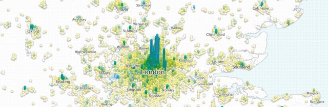
Section of the activity density map showing London and surrounding areas.
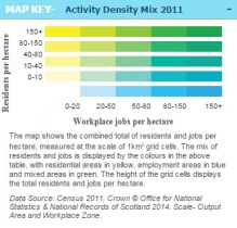
The color key for the activity density map
The maps in Luminocity are overlaid with a grid of 1 km-square hexagonal columns. Each hexagon displays information using both a color code and the relative height of the column. A particularly interesting use of color coding is shown in the image above. The map displays what is called an “activity density matrix” that combines where people live with where people work in a single display. Residential density is shown in shades of yellow, occupational density is shown in shades of blue, and areas where people both live and work are shown by mixing the relevant shades of yellow and blue to make shades of green. The map contains a lot of useful information in an elegant and easy to understand manner.
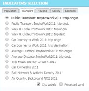
Indicators Selection box that is used to access the different maps in Luminocity.
The different maps can be quickly accessed through a box in the upper right corner of the display. A box on the lower left of the display summarizes the information shown in the entire map in a graphical format. The urban areas shown in the map are represented by circles in the graph and hovering the mouse over a circle pops up detailed statistics for relevant urban area.
The color key for reading each map is in a box in the lower right corner. This box also contains information about the source of the data displayed in the map and in most cases provides a link to a website where users can download the data tables themselves or query the data tables with their own set of variables. This is an exceptionally useful feature of Luminocity because it allows the user to ask questions of the data that may be suggested but not answered by the different maps.

Section of a map showing adult age distribution in London and surrounding areas.
Luminocity is a brilliant example of how new and creative data visualization tools and techniques can bring valuable and interesting information to people using a visual format that is straightforward and easy to understand. The only problem with Luminocity is that once you’ve spent some time with it, you want to see other countries get the same treatment.