

An earlier Info Monkey article suggested that the audience for e-sports is just the audience MLB (and every other major sport) wants to attract. It also argued that tinkering with tiny adjustments to speed up the game isn’t likely to attract this audience. If shaving 15 minutes off of the average game isn’t the answer, how do you expand baseball’s audience? Focus on one of the game’s great strengths, give people new ways to engage with the game, and give them the information they need to engage with baseball in new ways.
 Baseball has long been characterized as the thinking person’s game. Why? Because it’s deeply complex, small adjustments on the field can have large effects on the game’s outcome, the pitcher-batter conflict that lies at the core of the game is infinitely nuanced, and there is barely enough time in between pitches to try to take all of this into account and decide what to do next. This combination of decision time and tactical depth is one of the game’s great strengths. If you want to grow the audience for baseball, give people new ways and means to engage with the game at this level.
How do you do that? In this article I’ll look at giving the TV audience more and better information about the game. In Part 2 I write about giving fans something to do with this information.
Give the audience information that makes the game come alive
Much has been made of the ways advanced analytics in combination with real-time data gathering systems like PITCHf/x and Statcast have given baseball executives, managers, and analysts new insights into the game. Many broadcast networks are bringing this information to the audience but they tend to do it in limited, unimaginative, and largely ineffective ways. There is enormous potential here to open up the game in ways that will engage the audience and increase interest in televised baseball. Want to attract a wider audience that isn’t afraid of technology? Take steps to realize this potential.
Here are a few examples. There are many more.
 Illustrate the shift. One network puts a small graphic in a corner of the screen that uses red dots to show the positions of the infielders on a play-by-play basis. The graphic is almost never explained and never referred to by the broadcasters. In it’s current form it’s basically a waste of screen space but it could be much more.
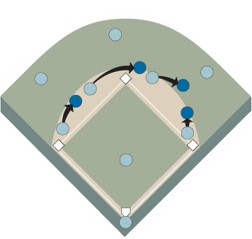
Illustrate the shift with a graphic like the one on the left that uses arrows to indicate changes of position, dots of one color to show the “normal” position, and dots of a different color to show the shifted position. This clearly shows the viewer whether and how much the infield is shifting. The “normal” position can be shown in a number of ways to illustrate different points for the audience. For example, “normal” could be a basic arrangement with all infielders equally spaced. It could be the average position of all major league infields, or the average position of the team that is in the field.
With appropriate commentary this type of graphic could be used to compare shifts used by a team against different batters. It could be used to compare shifts used against the same batter when he is facing different pitchers, or different counts, or different situations with runners on base. Variance around the equally-spaced infield position could be used as an index of how much each team relies on defensive infield shifts.
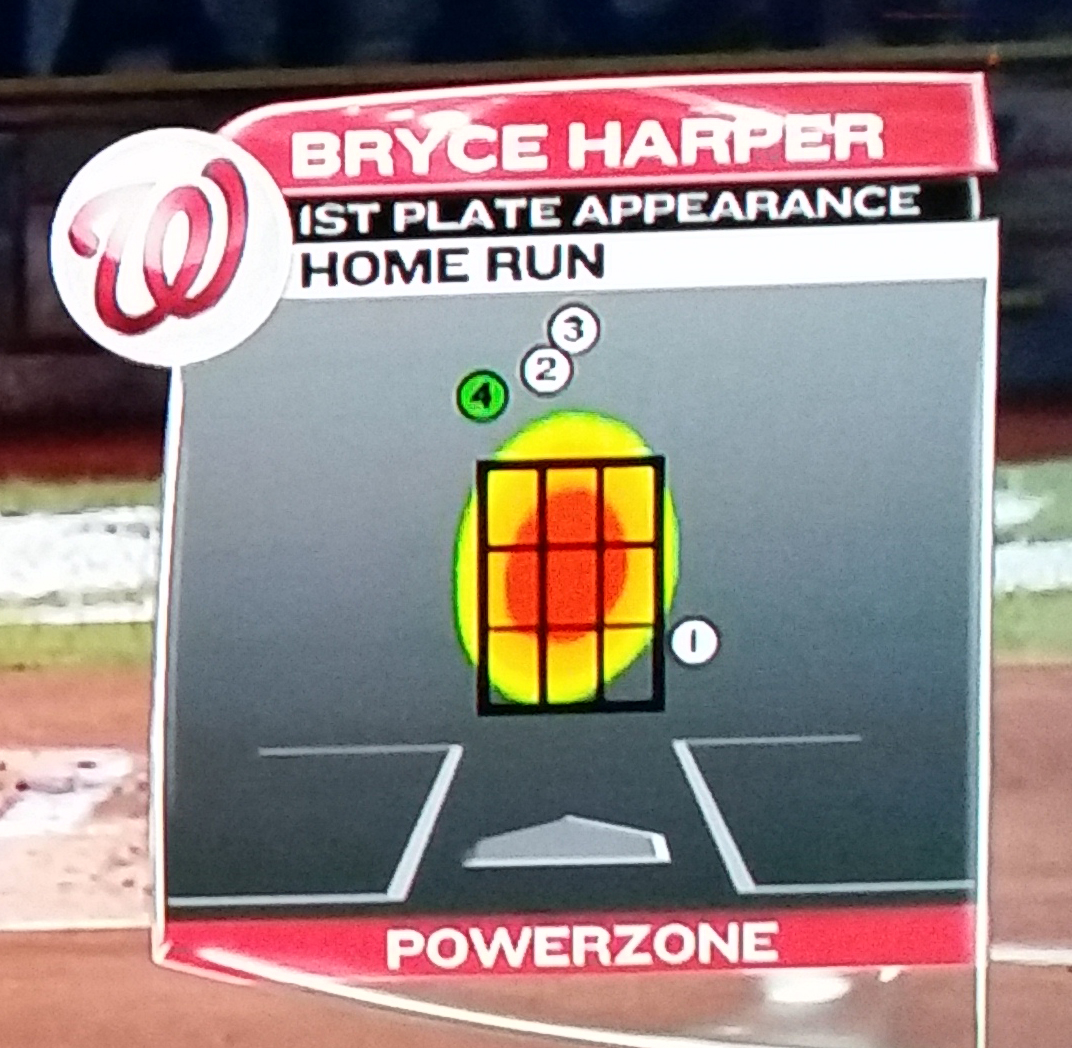 Heat maps. Networks commonly use heat maps to illustrate something about a batter’s performance in different areas in and around the strike zone. Usually these heat maps appear on the screen with little or no commentary about what the map is actually showing. For example, what does the heat map part of the “Powerzone” tell you about Bryce Harper? Does it show the areas of the zone where her puts the ball in play? Where he makes contact that results in a hit? Is slugging percentage somehow factored in or is a single equal to a home run as far as the heat map is concerned?
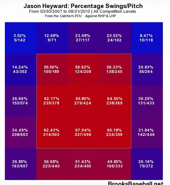
Jason Heyward percentage of swings per pitch location. From BrooksBaseball.net
Heat maps could be used to illustrate all of these things and more for the viewer. Where in the zone do pitchers tend to pitch to this hitter? Where does he tend to swing? Which zones are good for strikes? How does this change when the batter faces a left or right-handed pitcher? How is it affected by the pitch count?
Heat maps could also be used to illustrate how a pitcher attacks the strike zone. Different colors could be used to illustrate different pitches within a single graphic. The frequency with which the pitch is thrown could be shown by shades of color. If that graphic is too busy and hard to understand at a glance, each type of pitch the pitcher throws could have its own heat map and the maps could be compared side-by-side allowing the viewer to instantly grasp how the pitcher works the zone.
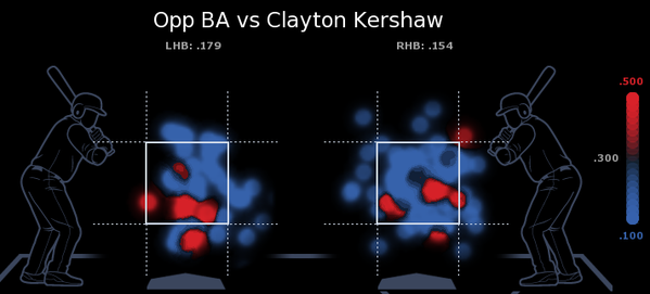
Pitching could be examined with many other insightful heat maps. Opponent’s batting average is one example. Where the pitcher throws in different pitch counts is another. What kind of pitch does a pitcher tend to throw in 2 strike counts? Where does he tend to throw it? Does he have different tendencies in 3-2 counts and 0-2 counts? Where in the zone and with what kind of pitch does he tend to get swinging strikes? Called strikes? Hits?
Gathering the data and building the graphics for these heat maps may sound like a lot of work but as fans of Fangraphs know, it’s already been done. Fangraphs has interactive heat maps that show everything suggested here and a lot more for every player in the major leagues.
Making use of information to engage the audience
Developing more informative graphics that are designed to help the audience engage with the game in new ways is easy. The data exists, the graphics exist, and several networks are already using them in their broadcasts. The problem is that they are using them poorly. Fancy graphics are wasted unless they are paired with broadcasters who can clearly explain what the graphic illustrates and use this information to provide insight into the game. That’s the hard part.
There are some baseball analysts who do a superb job of explaining what is happening on the field in ways that educate the audience about the richness and complexity of the game. However, many do not.
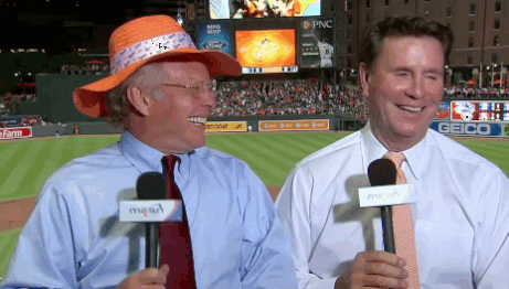
Baltimore Orioles broadcasters Gary Thorne and Jim Palmer
(Although the gif might suggest otherwise, Gary Thorne contributes good play-by-play and Jim Palmer provides good analysis of the pitcher-batter confrontation when he’s not reminding the viewer over and over again about how good he was back in the day. The gif, however, was just too good to pass up.)
Most analysts are former players or managers. This is ideal because, at least in theory, they have a deep understanding of the game. Unfortunately, that understanding is rarely used to provide insight into what’s happening on the field right here, right now. Instead the former players tell war stories about when they played the game which in some cases can be decades ago. How many more times are we going to have to listen to the ESPN crew yuk it up about John Kruk’s 25 year old All-Star plate appearance against Randy Johnson? They ignore the game and talk about where they went to dinner last night and what they had to eat, their children’s high school graduations, their favorite TV shows from back in the day, the lunchbox they thought was cool in grade school. Get a clue, it’s not about you. Pay attention to the game.

When they talk about the game they often talk in generalities rather than about specific circumstances that are affecting what is actually happening on the field. For example, they talk about what kind of pitch you can generally expect in an 0-2 count. Their focus is on the count and everything else is out of focus as if it didn’t matter. They don’t talk about how the generic 0-2 pitch might be modified by what’s been working or not working for this pitcher during this game, what the batter typically does with the generic 0-2 pitch, what the batter typically does with an 0-2 count, who’s on base, who’s on deck. The pitcher, batter, and catcher are thinking about these things and the former player would be thinking about them too if he was deeply engaged with the game and thinking like a player. He could tell us about what’s really happening on the field as opposed to what usually happens.
 Baseball has changed since many of the analysts played the game. The combination of advanced analytics and the gigabits of data produced in real time about every MLB game by PITCHf/x and Statcast have changed the way players are evaluated, strategy is shaped, and tactics are used during a game. It’s not uncommon for analysts who played in an earlier era to have a poor understanding of these changes and the analytics on which they are based. Worse, in some cases this lack of understanding is combined with a hostile or negative bias. Baseball is like any modern profession in that it changes and evolves. If you don’t want to learn new things, you are going to be out of date and left behind.
Bringing an analytics guru into the broadcast booth won’t solve the problem if he or she talks as if everyone listening understands analytics at the same level they do. You need someone who is good at explaining baseball analytics and sophisticated data visualizations in language that the typical viewer can understand. Someone who doesn’t talk in the arcane acronyms of advanced analytics. Someone who is not an ideological advocate for analytics but can use them dispassionately, pointing out both their strengths and their weaknesses. You need a good teacher.
 Pair this person in the booth with an open-minded former player and let the two of them cooperate to bring their respective areas of expertise together to analyze the game. Give them sophisticated information visualization tools and encourage them to create informative graphics that they can use to illustrate and explain what is happening on the field. Keep the focus on educating and informing the audience so that the viewer can engage more deeply with the richness and complexity of the game they’re watching.
Former players and analytics specialists love baseball because they have a deep understanding of how rich and engaging the game is. Give them the tools and the platform to share that understanding with the audience. One of the great strengths of baseball is that it is a thinking person’s game. If you want to attract a wider audience to baseball, double down on that strength.
In this article I presented suggestions about how to engage the audience by bringing them information that enriches their understanding of the game. In Part 2 I offer some suggestions about things baseball can do to engage the audience further by giving them something to do with this information.


Pingback: Baseball: Engaging the audience – Part 2 | THE INFO MONKEY