Why Did Your Diet Stop Working?

?????????????????

Does this sound familiar?

You decide it’s time to lose some weight.  There’s a hot new diet you’ve been hearing about and people you know swear it’s working for them.  You buy a book about the hot new diet; maybe you buy a couple of books about the hot new diet to get more meal plans and more recipes.  You might sign up for specially delivered diet meals. You go on the diet and you start losing weight. Awesome, the diet works. Until it doesn’t. Your weight plateaus and you still weigh more than you would like to.  You stick with it. Maybe you start to lose weight again and maybe you don’t.  If you do, your weight soon plateaus again and you’re stuck. What happened?

diet booksThe weight loss industry would have you believe one of two things caused your diet to fall short of producing the results you desired.  One possibility is that it wasn’t the right diet.  There are plenty of other diets out there and you can buy the books and try those.  And if that doesn’t work, there will be another hot new diet any day now that people will rave about and you can try that one. The other possibility is that you’re a failure.  If you’d stuck to the diet, you’d have lost the weight. But you didn’t.  You failed.  Better luck next time.

Is this what happened? You’re a failure or it was the wrong diet? Probably not. What probably happened was that your body responded to the diet in exactly the way the human body is expected to respond to a sustained decrease in the number of calories consumed every day.

Why didn’t your diet books tell you this was going to happen?

stomachTo begin to get an answer to this question, let’s take a look at the diet industry. At the end of 2013, the weight loss industry in the US was a $61 billion a year business. 61 billion is an incomprehensibly large number. Break it down. In order to spend $61 billion a year Americans spend about $1,934.30 per second on diet products and services and they do this every second of every hour 24/7/365. If you make $50k per year, Americans spend a little bit more than your annual income on weight loss products and services every 26 seconds. If you work for 50 years and average $50k income per year, Americans spend more on diet products and services than you will make in your entire life every 22 minutes.

Meanwhile, according to the Centers for Disease Control and Prevention the average adult American male is 5 feet, 9.3 inches tall and weighs 195 lbs and the average adult American female is 5 feet 3.8 inches tall and weighs 166.2 lbs. Somebody is getting fat and it’s not just the people who are throwing money at diets that don’t produce lasting weight loss.

calorie-balance
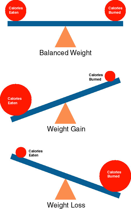
Scientists and physicians who aren’t trying to sell you something and who work in the area of diet and weight control have repeated the same simple message for many years. The most important factor determining weight loss is the difference between the number of calories ingested and the number of calories burned on a daily basis.  There are many factors that affect caloric intake and burn and many of them are not fully understood but the  general conclusion that you will lose weight if you consistently burn more calories than you ingest over the course of a day is very well established. It’s that simple.

This is the reason that your new diet worked. Suppose that before you started dieting your weight was fairly stable. Weight stability happens when the body is in energy balance, which means that, on average, the calories burned every day are roughly equal to the calories ingested every day. You start a new diet and reduce the number of calories you ingest during the day. Now that energy balance has been disrupted; you’re burning more calories than you’re getting every day. Under most circumstances the missing calories are provided by metabolizing stored fat and you lose weight.

Notice that this doesn’t have anything to do with which diet you’re following. Any diet will work because following any diet will usually result in ingesting fewer calories than your body typically burns in a day.  You don’t even have to follow a diet.  All you have to do is cut down the number of calories you ingest every day and do it consistently. In other words, you don’t need to give the weight loss industry any money in order to lose weight. The weight loss industry doesn’t publicize this for obvious reasons.

Failed DietSo, why does your diet stop working after you’ve been following it for awhile? Your daily activity hasn’t changed so you should be burning the same number of calories per day. You’ve stuck to the diet so the number of calories you ingest are still lower than the number you’ve been burning.  Why aren’t you continuing to lose weight?

The human body is a sophisticated homeostatic system which means that it adapts to changing conditions in order to keep important system parameters like temperature within an optimal range. For example, if the core temperature of the body gets too hot, you sweat to rid yourself of excess heat; if core temperature gets too cold, you shiver to generate more heat.

caloric-homeostasis
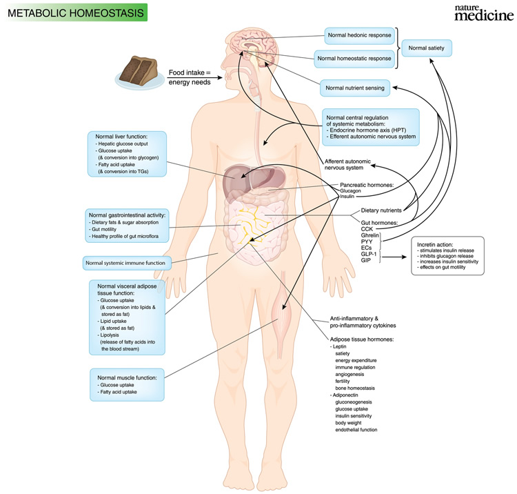
Another example is metabolic homeostasis which refers to the body’s mechanisms for maintaining a balance between caloric intake and caloric burn. Metabolic homeostasis is more complicated than previously thought and much about it is currently not well understood. One thing that appears to be soundly supported by the available evidence, however, is that the body adapts to a regular, sustained reduction in caloric intake by reducing the number of calories needed to fuel the level of daily activity that was typical before the calorie reduction took place.

intake equal burnThis is the reason your new diet stopped working. Suppose that on a typical day your regular activities burn 2000 kilocalories and you ingest about 2000 kilocalories in food during the day.  Your caloric intake and burn are balanced and your weight is stable.  Then you go on a diet and ingest only 1800 kilocalories a day.  At first you lose weight because the 1800 kilocalories you ingest is less than the 2000 kilocalories you burn each day.  However, if you stay on this 1800 kilocalorie per day diet for a period of time, your body will adapt to that reduced caloric intake by enabling you to engage in the same activity you were doing every day before you began the diet while only burning 1800 kilocalories.  Once that happens caloric intake and caloric burn are balanced again and you stop losing weight.

Notice that there’s nothing here about finding the right diet or about personal failure. There is no right diet. Any diet that is followed consistently will stop working because the body will adapt to the reduced number of calories that are ingested every day. You didn’t fail. Your body did exactly what was expected in the face of a sustained reduction in caloric intake; it adjusted caloric burn so that energy balance was once again achieved.

greedy2From the point of view of the diet industry this is almost the ideal scam. You can sell people any diet because any diet will work that involves reducing the number of calories ingested every day.  People lose weight and more products and services are sold.  If people stick to the diet, metabolic homeostasis will come into play and the diet will stop working. When that happens all the weight loss industry has to do is sell people on the idea that either (a) it was not the right diet for them, or (b) they failed at dieting. In either case they’re set up to try it again with the next round of weight loss products and services.

There are two general approaches you can take if you want to lose weight. First, you can tinker with your caloric intake levels and caloric burn activities until you find an equilibrium point where you are in energy balance, you are happy with your weight, and you are enjoying your life. It will take patience, discipline and a willingness to think for yourself and experiment with different intake levels and burn activities when metabolic homeostasis brings you to a weight plateau.

The other option is that you can contribute your money to the weight loss industry so it can continue to gorge on billions of dollars every year. Following this path will also take patience and discipline. It will also take a willingness to let the diet industry do your thinking for you while you spend more money on new diets and new exercise programs when metabolic homeostasis brings you to a weight plateau.

It’s your life, your time, your money, and your choice.

Posted in Critical Thinking, Health, Weight loss | Tagged , , , , , , | Leave a comment

The Seasons Come and the Seasons Go

BreathingEarth


A glance at the dance between the snow and the plants.

Here’s another version that combines the view from the north pole seen above with two other viewpoints.

breathing earth 2

John Nelson combined a series of monthly pictures of the earth provided by NASA’s Visible Earth project to create these gifs of the seasonal ebb and flow of snow and vegetation. He writes about how and why he created the gifs and provides links to larger versions on his UXBlog

The gif takes about 1.6 seconds to cycle through the 12 months of the year which means that if you find the gifs mesmerizing and you get lost staring at them for about 2 minutes and 8 seconds, you watched 80 years of your life go by as the seasons changed and changed again.

If the speed is a bit too fast, here’s a place where you can control the rate of change.  Click and hold on the center of the image and, with the left mouse button held down, move the mouse back and forth to change the seasons.

Posted in Earth | Tagged , , , , | Leave a comment

Can Psychology Be a Mathematical Science?


The-Chemist-Charles-Moeller-1875_opt (1)

Can psychology be a mathematical science?

The simple answer is “Yes, and it has been from the very beginning.” Psychology became a recognized science in the mid 1800s. The key finding that shifted psychology from a philosophical pursuit to a scientific one was the discovery of a quantifiable mathematical relationship between an objectively measurable physical variable (the change in magnitude of a sensory stimulus such as the increase or decrease in the brightness of a light or the loudness of a sound)  and a subjective psychological  variable (how much the sensory stimulus is perceived to increase or decrease by the person experiencing it).

Not only was scientific psychology founded on a mathematical basis but there are many psychologists who engage in mathematical theory building and testing every day, and there are several sub areas within the general field of psychology, such as cognitive science for example, that are firmly grounded on mathematical modeling.

That being said, it is still the case that psychology has not been as thoroughly or securely placed on a mathematical basis as several other scientific disciplines. One of the reasons for this is that that the basic phenomena of interest in psychology – human mind and human behavior – are much more complex than the basic phenomena of these other sciences.

350px-Ideal_projectile_motion_for_different_angles.svgTake Newtonian physics as an example. Suppose something is moving from point A to point B and you want to know the route it will take, how far it will travel and how long it will take to arrive.  If the something in question is a baseball or a cannonball, you can do a pretty good job of predicting these things based on the elevation above the ground from which the object was launched, the angle and the speed at which it was launched, and the gravitational constant.

altrouteThe situation is vastly more complex if the something in question is a person going home from work.  When predicting the route, distance and time taken by the cannonball you don’t have to take into account the conditions the cannonball thinks it might encounter along the route, how it thinks those conditions might affect its progress toward its destination, alternative paths it might consider and choose to take along the way, or a spur-of-the-moment decision to stop for a cup of coffee or pick up some ice cream for dessert. All of these things and more must be taken into account when we attempt to predict the route a person might take on her way home from work.

Putting a science on a mathematical foundation necessitates making the assumption that the phenomena that are the subject matter of that science have a structure that is mathematical at a fundamental level. Moreover, it isn’t enough to simply assume that the phenomena in question have a mathematical structure in some vague and general sense. The use of specific mathematical techniques requires that specific assumptions be met about the phenomena to which these techniques are applied. Determining whether these assumptions are met when the phenomena are as complex as they often are in psychology can be difficult.

height weight 2The mathematical techniques of regression and correlation are widely used to model psychological phenomena. Valid use of many of these techniques rests on the assumption that the variables that are used to measure psychological phenomena are linearly related. Variables are linearly related when a graph of the relationship between the two variables is a straight line. For example, human height and weight are linearly related as can be seen in the graph on the left.

Fechner'sLawMany variables in psychology have a regular relationship but that relationship is nonlinear. For example, the relationship between the objectively measurable change in the strength of a stimulus and the perception of change in the strength of that same stimulus mentioned in the first paragraph is logarithmic as shown in the graph on the right.

There are many different types of nonlinear relationships. Determining whether complex psychological phenomena are linear or nonlinear, and if they are nonlinear, what kind of nonlinearity they exhibit can be a very daunting problem.

Drs. Michael Dougherty at the University of Maryland and Rick Thomas at Oklahoma University have proposed an interesting and important approach to this problem with the General Monotone Model or GeMM. GeMM allows a simplification of the assumptions that are needed to model either linear or nonlinear relationships in psychological theory. Because the model relies on less stringent assumptions, it can be applied validly in a wider variety of cases.

All linear and many nonlinear relationships share the property of being monotonic or monotone. A relationship between two variables is monotonic when as one variable changes in a single direction (it either increases or decreases) the other variable also changes in only one direction (again, it either increases or decreases).

forgetting-curveMonotonic relationships can be either positive or negative. Both the linear relationship between weight and height and the nonlinear relationship between the perceived and actual increase in the strength of a stimulus shown above are positive monotonic relationships. The relationship shown in the graph on thedose response left between the amount of information remembered and the time that has elapsed since learning the information is an example of a negative monotonic relationship that is also nonlinear. The dose-response curve shown on the right is an example of a nonmonotonic and nonlinear relationship.

GeMM rests on the assumption that the variables that are used to measure psychologically meaningful phenomena are monotonically related. Under many circumstances it is much easier to provide evidence that supports this assumption than it is to provide evidence that variables are linearly related. In fact, one of the strengths of GeMM is that it can be successfully used as a basis for theory in psychology when you can’t tell whether the variables of interest have a linear or nonlinear relationship but you can provide evidence that the relationship is monotonic.

Having a model like GeMM that is easier to validate and can be applied in a wider variety of circumstances is only of value if the results that GeMM produces are as accurate as the models it replaces. When tested on linear data, GeMM performed as well or better than all of the strictly linear models that were tested on the same data. This means that when the variables of interest are in fact linearly related you don’t lose anything, and in some cases you actually do better, using GeMM than using models that are specifically designed for use with linear data.

When tested on nonlinear data GeMM performed better than all of the linear models that were tested on the same data. This is a major benefit because linear models, such as correlation and regression, are often used in psychology in cases where the relationship between the variables of interest may not be linear.

GeMM has several advantages over many of the linear models that are commonly used to capture the relationships between variables that measure psychological phenomena. First, GeMM rests on the assumption that variables are monotonically related and this assumption is often easier to verify than the assumption that variables are linearly related. Second, GeMM has a wider range of application because it can be used to model data that are either linear or nonlinear. Finally, GeMM performs as well or better than the linear models when the data are linear, and performs better than the linear models when the data are nonlinear.

Psychology has always been a mathematical science but applying mathematics properly in psychology is often more difficult than it is in some of the other mathematical sciences.  Theories like GeMM show promise of establishing psychology more firmly on a mathematical foundation by expanding the range of phenomena to which math models can be validly applied.

Posted in Psychology, Science | Tagged , , , , , , | Leave a comment

Precision Choreographed Martial Arts

Check out this video of a Chinese team from the 10th World Wushu Championships held in Toronto in 2009.


Amazing.

Roughly translated, “wushu” is Chinese for “martial arts”. Competitive wushu has two components: taolu (forms) and sanda (sparring).  I believe the video is of a performance in the taolu subdivision.

This style of wushu featuring a spear (qiang) in the hands of one of the combatants is a technique in the Changquan (Long Fist) category. The qiang has a red horse-hair fringe attached just below the blade on the tip.  The fringe is designed to serve two functions. When the point of the qiang is moving quickly the movement of the fringe makes it more difficult for the opponent to see and grab the haft of the qiang.  The fringe also absorbs blood so that the haft doesn’t become slippery or sticky after successful strikes.  Qiang used in war are made from hardwood.  The ones used in wushu are made from wax wood which is lighter and more flexible.

Here’s another video of the same match from a different camera angle.  I don’t even want to think about how many times the woman in yellow was hit in the face while they perfected this routine.

Posted in Sport | Tagged , , , | Leave a comment

A New Look at the Sun

sunAtmosphereSN

It’s too hot (or makin’ a dragon wanna retire part 2).

The photosphere of the sun (the part of the sun that is usually considered to be its surface) has a temperature of about 6,000 °C.  For comparison purposes, animal fat burns at 800 – 900 °C which means you wouldn’t last long on the surface of the sun. Wood and gasoline burn at about 1,000 °C. A propane torch burns at 1,200 to 1,700 °C while an oxyacetylene torch can reach temperatures of 3,300 °C.  So, yeah, the surface of the sun is hot but you already knew that.

What happens as you move closer and closer to something hot? The temperature gets hotter. Duh. As you move further away, the temperature decreases. Another duh. Except that’s not the way it works on the sun.

eclipse.enThe sun’s corona is the outer layer of it’s atmosphere. It extends millions of miles into space and it can only be seen during a full lunar eclipse like the one shown in the gif on the right. The bright ring around the blacked-out disc of the sun is the corona.

Here’s where things get interesting. The corona can’t be seen unless there’s a lunar eclipse because the photosphere is about a million times brighter. Remember that the temperature of the photosphere is about 6,000 °C.  The temperature of the corona, which is about 2,000 kilometers away from the photosphere, is about a million °C. The corona is much, much dimmer and much, much hotter than the surface of the sun.

What’s going on? The dimmer part is easy.  The corona is much less dense than the photosphere so there is much less material to emit light.  The hotter part presents a problem.  It’s called the coronal heating problem and, as it’s put on a Caltech website, it’s like trying to explain a flame coming out of an ice cube. Until recently a plasma wave theory and a magnetic field theory have been the main contenders to explain why the corona is so much hotter than the photosphere but neither appears adequate to the task.

Now there’s another theory to consider.

nustar141222_Tn

The image above is one of the first pictures of the sun taken by NASA’s Nuclear Spectroscopic Telescope Array or NuSTAR. NuSTAR, which launched in 2012, is an orbiting telescope that is sensitive to high-energy X-rays.  The picture shows an eruption of those X-rays above sunspots.

It has been hypothesized that the extreme heat of the corona might be explained by nanoflares which are small eruptions of charged particles and high-energy radiation.  The problem with testing this hypothesis is that there has been no way to detect whether or not these nanoflares exist.  Until now.  If nanoflares exist, NuSTAR should be able to detect them because the nanoflares are expected to emit high-energy X-rays.

An interesting side story here is that NuSTAR was designed and developed to gather information from black holes and other phenomena that are far removed from our galaxy, let alone our solar system.  The people who run the NuSTAR program had to be convinced that a tool made to look at what was very far away could also produce valuable results if used to look at something that was nearby. Sometimes thinking outside the box involves looking differently at something that is inside the box.

Here’s another picture of the sun which was taken on January 1, 2015 by the Atmospheric Imaging Assembly on NASA’s orbiting Solar Dynamics Observatory.

Sun on jan 1

The large black area at the bottom is a hole in the corona where the magnetic field allows particles to escape into space instead of being trapped and returned to an area near the surface where they produce the golden glow seen over the rest of the image.  This has nothing to do with trying to solve the problem of why the corona is so much hotter than the photosphere but the picture is too cool to pass by.

Posted in Science | Tagged , , , , , | Leave a comment

How Reliable Are Conclusions Based on Social Media Data?

Dawn-of-Big-Data

The popularity of social media, the digitization of large databases, smartphone, laptop and tablet apps that gather user-generated data, the internet of things, and the reliance on cloud storage has increased the availability of very large data sets for both discovery and predictive analyses. These large data sets, usually referred to as big data, carry with them difficult problems associated with developing data mining and statistical analysis methods that are capable of handling the enormous amount of data involved without introducing error into the analysis.  The data are there but making good use of these data can be difficult, expensive and time consuming.

The temptation to use big data without adequate concern for the possible problems involved is great.  An internet economy that is driven by click counts coupled with data owners such as Facebook and Twitter that are eager to increase profits by selling access to their data can easily produce click-bait headlines, flawed analyses, or unsound conclusions that are based on poorly understood and badly analyzed big data.

soc med botsIn a recent article published in the journal Science researchers from Carnegie Mellon and McGill Universities pointed out a number of ways data drawn from social media sites can be compromised. For example, data that is publicly displayed on a social media website (e.g., what’s trending on Twitter) may be filtered by the website owner and the hows and whys of the filtering process are usually hidden from users. In addition, social media data from real users is likely to be combined with data from bots, paid or malicious spammers, and public relations firms who are pretending to be real users as a way to market their clients.

In order to draw justified conclusions about a large group such as adults or voters in the US (usually referred to as the “population” in statistical analyses) based on data drawn from a smaller group such as data drawn from social media sites (the “sample”), the small group has to have the same characteristics as the large group with regard to the question you are trying to answer. Statisticians call a small group that has the appropriate characteristics a representative sample.

Representative-sampleThe size of the sample, has nothing to do with whether it is representative of the population of interest or not. You can’t draw justified conclusions about whether men prefer to watch baseball or basketball on TV by sampling women’s TV viewing habits no matter how many women you include in your sample. The fact that social media sites have an enormous amount of data at their disposal doesn’t mean that samples drawn from these data are representative of the populations that are of interest to their customers. If the sample isn’t representative of the population of interest, it doesn’t matter how big it is; it’s useless for answering questions about the population of interest.

A simple and straightforward source of potential problems with social media data is that different social media sites attract different audiences. In an earlier post The Info Monkey looked at a report from the Pew Research Center on social media demographics which showed that Facebook, Twitter, Instagram, Pinterest and LinkedIn are used by different, and sometimes markedly different, kinds of people. Drawing conclusions about a particular demographic group based on data from a different demographic is, at best, a way to guarantee that your conclusions are unjustified, and is, at worst, a recipe for disaster.

pinterest-logoHere’s a fictitious example of the representativeness problem using social media data. Suppose you want to find out which pop music stars are most popular among teenage boys so you can hire these stars to market your product to male teenagers. You decide to answer this question by counting the number of times different stars’ pictures appear on Pinterest. Pinterest tends to be used by suburban women. A sample drawn from Pinterest users is not going to be representative of the population of teenage boys.

Could you answer the question about the popularity of pop music stars among teenage girls with Pinterest data? Pinterest users tend to be female but they also tend to be 49 years of age or less, have completed at least a college degree and have annual incomes greater than $75,000 a year. A sample drawn from Pinterest users is not going to be representative of the population of teenage girls because few, if any, teenage girls have completed college and have annual incomes over $75K per year.  The generally older, more educated, and wealthier women who tend to use Pinterest are unlikely to have the same tastes in music as the younger women whose taste in pop music you are trying to determine.

Voter DemographicsHere’s a real example of the representativeness problem using social media data. The graphic on the left was used to illustrate a supposed “correlation” between age, the percentage of people within each age group that votes, and the use of social media.  You are supposed to draw the conclusion that, for example, people between 35 and 54 tend to use Facebook and Twitter and are more likely to vote than other age groups. This was offered as one piece of evidence that social media are effective in reflecting the views of potential voters in the US.  The idea was that you could get an accurate idea about what 35 to 54 year old voters in the US think about different candidates by seeing what they have to say about those candidates on Facebook and Twitter. Unfortunately, there is a serious representativeness problem here.  Facebook users tend to be women who are 49 years of age or younger, have completed some college, and have annual incomes of $30K or less while Twitter users tend to be non-rural, non-hispanic blacks who are 29 years of age or younger.  Neither group is representative of the population of US voters between the ages of 35 and 54.

social-media-platform-demographics-300x300In general, data drawn from US users of Twitter, Instagram Pinterest or LinkedIn do not provide representative samples of the US population.  The users of each of these social media platforms are biased toward different segments of the population.  Even Facebook, which according to the Pew report is used by somewhere between 60% and 65% of US adults, is skewed toward women who have completed some college, are aged 49 or less, and who make less than $30K per year.  None of these social media platforms produce data that is generally representative of the US population.

If you care at all whether the evidence that is offered supports the conclusions that are reached, then analyses or predictions based on social media data should be considered with a great deal of caution. Anyone who uses social media data as the basis for their argument needs to address how they have dealt with the inherent limitations of these data.  If they don’t, it means that either they’re clueless about this stuff, or they understand that their conclusions are not well supported by their data but they think you’re clueless and you’ll believe anything that has numbers in it because you saw it on the internet.


Posted in Critical Thinking, Social media | Tagged , , , , , , , , , | 2 Comments

Watch Cyber Attacks in Real Time

cyber attack

Norse is a company that monitors world-wide internet traffic, identifies and tracks high-risk IP addresses, and sells this information in the cyber-security market.  They also maintain a web page that lets you to watch cyber attacks all over the world in real time. The still picture above doesn’t begin to do it justice.  You can check out the real-time map here.

What you see in the map is just a small fraction of the data Norse tracks in real time. Their website claims they monitor over 200 terabytes a day of risk traffic and log approximately 50K attacks every second.

Norse gathers attack data through a network of over 8 million sensors that are designed to mimic approximately 6,000 different types of hardware and software platforms that are commonly subjected to cyber attacks.  They maintain 167 data centers around the world and have over 1 billion risk-assessed IP addresses in their database each of which is scored on 1,500 risk factors. They typically identify 10K new “species” of malware every day.

Given the sheer amount of attack data Norse is processing every second, 24/7, the real-time data they show on their website is severely limited and the real-time map is little more than a toy.  It’s a very cool toy, though.


Posted in Information visualization | Tagged , , , | Leave a comment

Christmas

The Info Monkey is taking off for the holidays.

Before we go, here’s a Christmas video.


Have a wonderful holiday, everyone.

Posted in Charitable giving | Tagged , , , | 1 Comment

What Music Looks Like

This one is awesome.

Cymatics is field of endeavor that explores capturing sound in a physical medium. As an area of exploration cymatics appears to be mainly about science and technology, although some see it as an opportunity to engage in mystical thinking about sound.

Nigel John Stanford is a musician from New Zealand who got into cymatics.  The result was this amazing video. Watch it through to the end.


At the end of the video Stanford is being zapped by a Tesla coil while wearing a Faraday suit.

As Stanford explains in an excellent Behind the Scenes piece, the music was written after the filming was completed.  From a compositional point of view, it’s a good example of how external factors (e.g., the time it takes for the sand to settle into a pattern on the Chladni plate) can play a role in the creation and development of a musical piece. This is something that continues to fascinate me when I compose and play music as Parametric Monkey. Pieces go to places you didn’t anticipate because of both musical and non-musical factors you didn’t think of beforehand.

Behind the Scenes includes a series of short videos about how each of the effects shown in the music video was created. What you see in the music video is even more amazing if you take the time to look at these short videos and see what went into creating each of the effects. For an example, here’s the short video about the Tesla coil and the Faraday suit.


Behind the Scenes also bravely and honestly points out that some of what you see in the video that might be understood initially as a direct visual reflection of the sound you are hearing is in fact not quite that.  No matter, the video is awesome.

Posted in Music | Tagged , , , , , , , | Leave a comment

Social Media Demographics

01-internet-use-over-timeHow deeply has the internet penetrated US society? What kind of people are online? How many US adults who are online make use of social media? Are there differences in the kinds of people that use different social media? The Pew Research Center has been tracking internet usage for 25 years and can provide at least partial answers to these questions.

If you thought that just about everybody uses either the internet or email, you’re right. Data gathered in January 2014 indicate about 87% of US adults use the internet.  However, there are some interesting demographics in play here. There are no statistically reliable differences in internet use when the data are broken down by sex, ethnicity or where people live (urban, suburban or rural). As most people would expect, there are age differences. The youngest group (ages 18-29) uses the internet more than all others while the oldest (65 and above) uses it the least.  The seniors are not as disconnected as you might think, however. Approximately 57% of people 65 and over use the internet.

There are also differences in internet use with both household income and level of education.   Adults in households with yearly incomes of $50K or greater make more use of the internet than those who make less.  Also, people who have completed college or an advanced degree or degrees use the internet more than anyone else. With a use rate of 77%, people with a high school degree or less make less use of the internet than people in any other education category.

samantha_john_hopscotch-300x225It seems there’s an opportunity being missed among this low-education group.  The ability to write code is probably the most widely marketable skill in the US economy right now as there is a digital component to just about everything we do, buy, or use for entertainment. Moreover, programming typically pays well (in 2012 median annual salary for programmers was about $74.2K) and is one of the occupations where demonstrable skill is much more important than an academic degree in finding a job.  Self-motivation, discipline, an internet connection and less than $100 are all you need to make a substantial start on learning how to program in any one of a variety of languages.

Things get more interesting when we look at demographic breakdowns among online adults who use social media.  Unfortunately, the only social media the Pew Center gathered data about for a report issued in 2013 were Facebook, Twitter, Instagram, LinkedIn and Pinterest.  It would have been nice to know about Tumblr, YouTube, Reddit and Google+ as well.

facebook logoNot surprisingly, Facebook is the dominant social media website. 73% of online adults use social media and 71% of online adults use Facebook. Facebook users tend to be women who are 49 years of age or younger, have completed some college, and have annual incomes of $30K or less. There are no reliable differences among Facebook users for ethnicity or type of living community.

twitter-logoApproximately 18% of online adults use Twitter.  Twitter users tend to be non-rural, non-hispanic blacks who are 29 years of age or younger. There are no reliable differences among Twitter users for sex, level of education or income.

Instagram logoApproximately 17% of online adults use Instagram.  Instagram users tend to be non-rural, non-hispanic black women who are 29 years of age or younger and have completed some college. There are no reliable differences among Instagram users for level of income.

pinterest-logoApproximately 21% of online adults use Pinterest.  Pinterest users are much more likely to be women and tend to be 49 years of age or younger, have completed at least a college degree, have annual incomes of $75K or more and live in the suburbs. There are no reliable differences among Pinterest users for ethnicity.  Pinterest users are the most demographically distinct of all of the groups in the Pew report.

transparent-Linkedin-logo-iconApproximately 22% of online adults use LinkedIn.  LinkedIn users tend to be non-rural, non-hispanic men who are between 30 and 64 years of age, have completed at least a college degree and have annual incomes of $50K or more.

In Critical Thinking: How Reliable are Conclusions Based on Social Media Data? we take a look at how these demographic differences can impact analyses and predictions that are based on social media data.

Posted in Demographics | Tagged , , , , , , , , | 1 Comment