What Goes on in Your Head During Creative Musical Improvisation? Part 1

improv fmri

This is the first of a two-part article about goes on in your head when you’re improvising music. In this part we’ll look at what’s happening in the brain during creative musical improvisation. In the second part we’ll look at the conscious experience of creative improvisation and tie it to what’s happening in the brain.

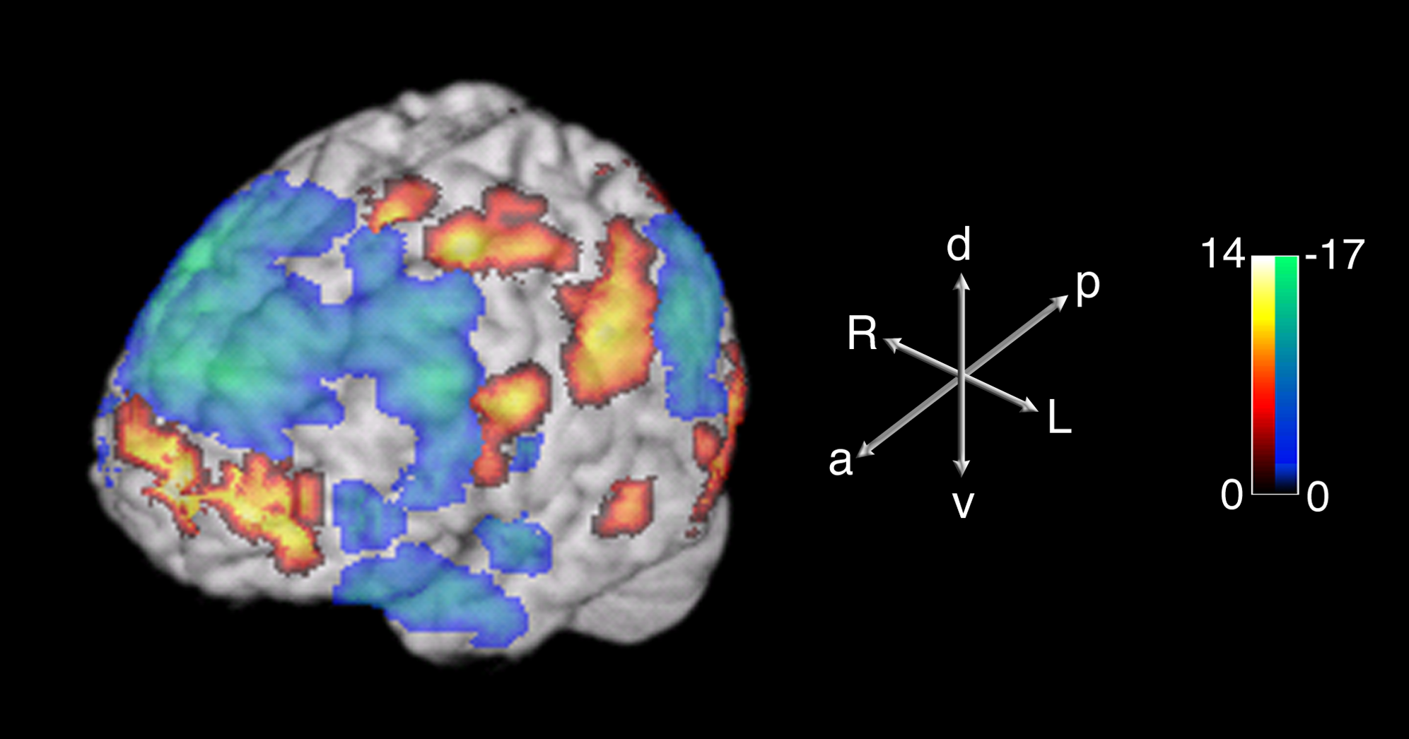
The image at the top is from a study published in 2008 by Dr. Charles Limb at Johns Hopkins and Dr. Allen Braun at NIH. They used functional magnetic resonance imaging (fMRI) technology to examine what was going on in the brain of highly trained jazz pianists while they were improvising. The yellow-orange-red colors show areas of high activation and the green-blue colors show areas of low activation.

fmri machineFirst, some background about fMRI. MRI is a non-invasive technology that provides detailed, high resolution images of internal structure. It is commonly used to diagnose injuries, internal structural defects, and cancers of various kinds. MRI alone does not provide any information about function.

The “f” in fMRI refers to a technique for coupling information about activity in the brain to the high resolution pictures provided by MRI. Blood flow increases to areas of the brain that are highly active in order to provide the fuel that the active neurons are burning. This increase in blood flow can be monitored non-invasively while the brain activity is taking place by using a technique that measures magnetic differences between the oxygen-rich blood that is feeding the active neurons and blood that is oxygen poor after having fed the neurons.

Drs. Limb and Braun used this fMRI technique to examine brain activity in highly trained jazz pianists while they were improvising. Some of the scans from their study are shown in the image below. Each scan shows a horizontal slice through the brain beginning with a lower portion of the brain labeled -24 and ending with a higher portion of the brain labeled 60. The last picture on the bottom line shows the positions of the horizontal slices.

improv fmri slices

Dr. Braun and his colleagues carried out a similar study in 2012 that examined brain activity in accomplished freestyle rappers while they were improvising. The results for freestyle rappers were similar to the findings Limb and Braun had previously reported for jazz pianists.

What did they find?

Prefrontal_cortex_(left)_-_lateral_view
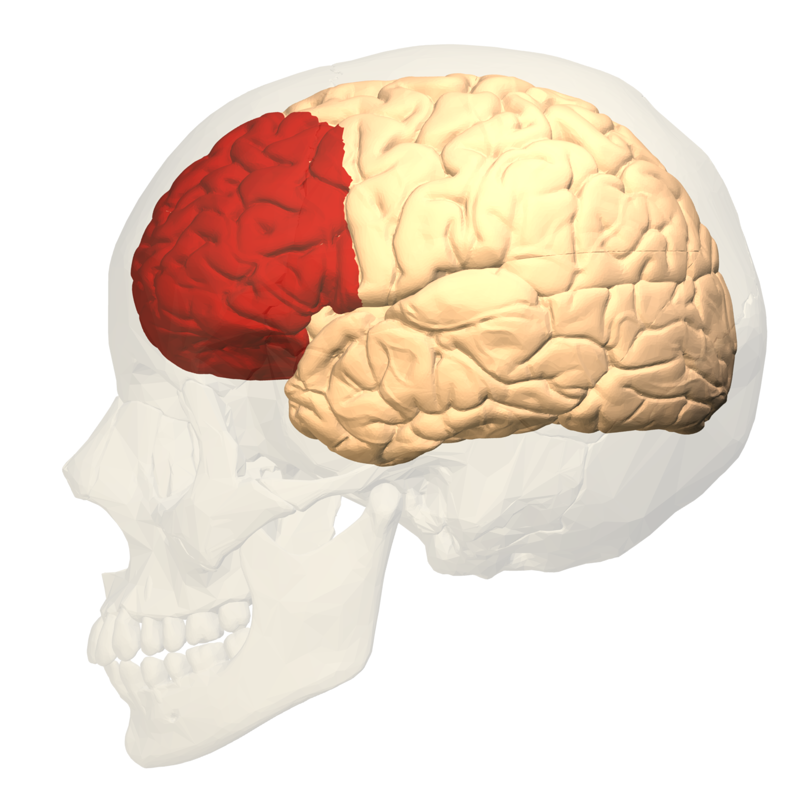
Limb and Braun compared brain activity when improvising with activity when playing a memorized musical passage and found an intriguing pattern of contrasting activation and deactivation in prefrontal cortex. Prefrontal cortex is the the area in the front of the brain that lies behind the forehead (shown in red in the image on the left). It appears to be the area of the brain where higher cognitive functions like planning, decision making, problem solving, and controlling and modifying behavior take place.

medial prefrontal cortexIn the studies involving jazz pianists and freestyle rappers an area of the prefrontal cortex called the medial prefrontal cortex, seen in the image on the right, showed an increased level of activity when improvising as compared to performing a memorized passage. The functions carried out in this area of the brain are not fully understood but research suggests medial prefrontal cortex is involved with maintaining a set of goals or intentions at a level that is independent of the specific behavior that is being carried out to accomplish the goals or fulfill the intentions. For the improvising musician, this might correspond to the intention of expressing an exuberant sense of joy or a quiet feeling of sadness that is independent of factors such as the technique need to play a particular instrument or the chord structure of the song being played.

deactivated areasAt the same time that medial prefrontal cortex is activated during improvisation, large areas of lateral prefrontal cortex are deactivated when improvising as compared to performing a memorized passage. In Limb and Braun’s studies the deactivation took place in the lateral orbitofrontal and dorsolateral prefrontal areas which are show in the image on the left.

The lateral orbitofrontal area (shown in gray-blue in the image above) is thought to be involved in consciously monitoring behavior that is being carried out to achieve the goals that are maintained in the medial prefrontal area. It is also thought to be involved with inhibiting these behaviors if they are thought to be incorrect or socially inappropriate. When playing music, this area may be involved in inhibiting playing that strays too far outside constraints imposed by a narrow view of melodic, harmonic or rhythmic structure. Deactivation in this area could lower or remove this source of inhibition which would give the musician more freedom to improvise creatively.

The dorsolateral prefrontal area (shown in purple in the image above), which is also deactivated during improvisation, is thought to be involved with monitoring and adjusting sequences of learned behavior that require keeping the sequence in memory while the entire behavior is carried out. When playing music, this area may be involved in carrying out a well-practiced sequence of notes. Deactivation in this area could provide the musician with more freedom to improvise by decreasing the likelihood that the notes the musician is playing will follow well-practiced and commonly played routines.

Eyedea

Eyedea

Whether an improvising musician is a pianist or a rapper, their performance involves more than pure improvisation. The pianist must play a piano; the rapper must “play”  his or her voice. In most cases the musical piece being played is not completely free of any kind of musical structure but is subject to some melodic, harmonic and/or rhythmic constraints. The brain (and spinal cord) must support the entire musical performance, not just the improvisational aspects of the performance. Processing this other information accounts for the activated and deactivated areas seen in the brain scans that are outside of the prefrontal cortex.
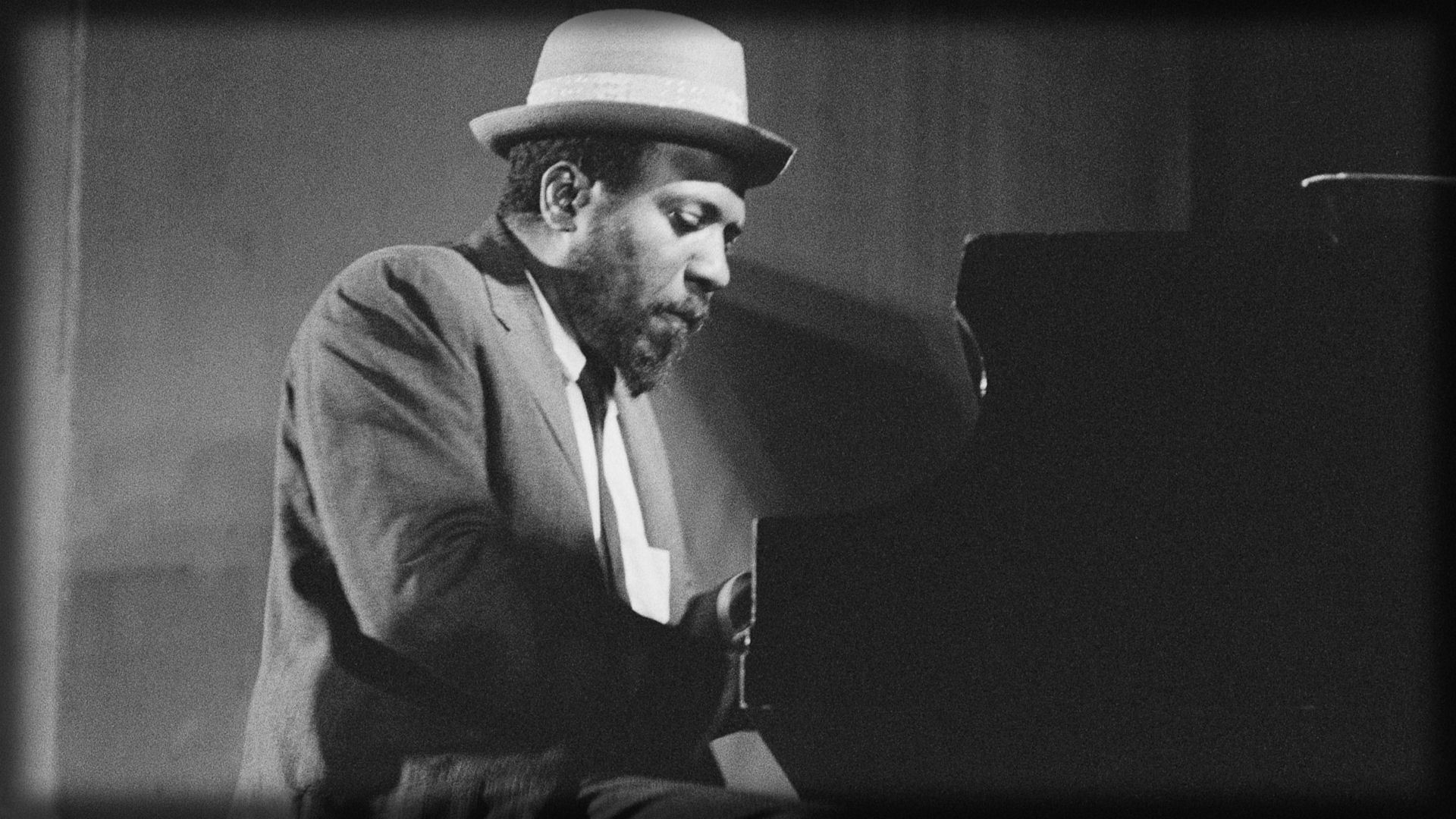
thelonious_monk_hat_piano_play_show_7859_1920x1080

Thelonious Monk

The areas of activation and deactivation in the prefrontal cortex appear to go a long way toward explaining how the purely improvisational part of a musical performance is carried out in the brain. Activation in the medial prefrontal cortex enhances the musician’s focus on the ideas or emotions he or she is trying to express. Deactivation in the lateral prefrontal cortex reduces the tendency to play highly memorized and often repeated sequences of notes and weakens the limitations imposed by playing within tightly constrained musical structures.

Although the research carried out by Drs. Limb and Braun does not address this issue, it would not be surprising to find that the activation and deactivation patterns they observed in prefrontal cortex are present when people are being creative in areas other than music. The focus on personal goals coupled with freedom from constraint that appear to be supported by these fMRI studies would seem to be involved with virtually any type of creativity and the areas of prefrontal cortex that are activated or deactivated in these studies are not specifically linked to anything having to do with playing a musical instrument or thinking in musical terms.

This article examined patterns of activation in the brain when a musician is improvising. In What Goes on in Your Head  During Creative Musical Improvisation? Part 2 we link this brain activity to some of the ways musicians describe musical improvisation and creativity.

Posted in Music, Neuroscience, Science | Tagged , , , , , , | 1 Comment

A Bike Share Map

Kevin Murnane's avatarTuned In To Cycling

DC bike share mapOver 700 cities around the world have implemented bike sharing systems that allow people to make use of public bikes for short trips within the city.  The motivation is to reduce air pollution, noise and vehicular traffic congestion while providing people with the health benefits that come from daily exercise (which has been shown to decrease the costs of city-provided health services). The bikes can usually be used for free or for very low cost.

Oliver O’Brien, a researcher in the Geography Department of University College London has built a bike-share map that tracks the locations of bikes in the bike share systems of about 100 cities throughout the world. You can start with a global map and then click on the city of your choice to check out the more-or-less current state of the bike-sharing stations in the city. For example, here are the maps for Washington DC, New York

View original post 219 more words

Posted in Information visualization | Tagged , | Leave a comment

How Much Snow Have You Had?

snowfall

Boston has been buried in snow this winter as has much of New England. However, most of the rest of the United States has had less snow, and often much less snow, than normal.

The map above compares an average winter’s snowfall with the snow that has fallen this year from December 1 through February 17. As you can see, there is a band through the upper midwest that has had above average snow but the usually snowy states of Minnesota, Wisconsin, Michigan and North Dakota have been having a light snow winter. Most of the Rocky Mountain states along with everything west of the Rockies is light on white this winter as well. At least as far as snow is concerned, it has been a pretty easy winter for most of the country thus far.

The map is from Climate Central, that, in its own words, is

An independent organization of leading scientists and journalists researching and reporting the facts about our changing climate and its impact on the American public.

The website is a seemingly rich resource for information about climate and weather that has one apparent weakness. They do not appear to provide the user with information about where their data are coming from or, if they provide this information, it is not obvious where to find it on the website. For example, the article that accompanies the average snowfall map doesn’t tell you anything about either the source of the data about this year’s snowfall or how the average snowfall for the country was calculated. Does Climate Central’s snowfall data come from a government source like the National Weather Service, a private source like AccuWeather, or is it their own data? Which years was the average calculated over? Did the same set of years go into the average for each of the points on the map?

The user isn’t given any information that would allow one to answer these questions. This isn’t to say that there are problems with the data Climate Central uses. I would hazard a guess that there aren’t but the user shouldn’t have to guess. The missing information is fairly basic and straightforward and is important for users who wish to evaluate Climate Central as a source for reliable climate and weather information.

Posted in Seasons, Weather | Tagged , , | Leave a comment

The Japanese Game Industry Today

Takeshi_Oga_final.0

Art by Takeshi Oga, from Polygon’s Life in Japan


From the early 1980s to the early 2000s Japan was at the forefront of the gaming industry. Sony, Nintendo and Sega made the premier consoles. Nintendo dominated (and continues to dominate) the hand-held market. Japanese franchises like Final Fantasy, Super Mario, Zelda, Resident Evil, Metal Gear, and Metroid were innovative and immensely successful. It’s estimated that Japanese games and gaming systems had approximately 50% of the world-wide gaming market in 2002.  By 2010 the Japanese share of the global market had shrunk to an estimated 10%.

This drastic loss of market share is certainly newsworthy. However the gaming media has generally done what news media in all areas tend to do in an internet environment that demands constant, so-called “content” updates in order to drive clicks to a website – defined the story narrowly and pursued it with blinders on. Typically the result is a steady stream of rehashes and minor variants on the same limited set of topics and ideas. Well-known Japanese industry veterans take turns complaining that the current gaming industry in Japan is terrible. Analysts and pundits hash and rehash which factors are responsible for the decline.

Vincent_Hill_final.0

Art by Vin Hill, from Polygon’s Life in Japan

The gaming website Polygon took a different approach. Rather than another rehash of what went wrong in the past, Polygon took a look at what’s going on now.  And they did it with style by combining art, music and a collection of eighteen articles about various aspects of Japanese gaming under the title Life in Japan.

The art is provided by five artists that Polygon invited to submit a piece that captured the artist’s ideas about the current gaming industry in Japan.  Two of these pieces are shown above.  The picture at the top of this post is the work of Takeshi Oga who has worked on Final Fantasy 11 and the Siren series, and who was the lead concept artist on Gravity Rush. The second picture is by Vin Hill who has done a set of pieces designed to show what an Assassin’s Creed title might look like if it was set in Japan.  The five pieces rotate in full-screen mode on the splash page for Life in Japan.

ninja_gaiden-38.0

Keiji Yamagishi

The music comes in the form of a jukebox with four varied tracks composed by different Japanese composers who are known for their game music . The first track in the set, appropriately titled “First Contact”, debuts a track by Keiji Yamagishi who wrote the music for the NES version of Ninja Gaiden. Think of chiptune influenced dubstep and you’ll be in the right ballpark.  Outstanding  panning and spatial positioning of instruments if you have a sound setup that allows that aspect of the music to come through. It rocks.


Virtua_Fighter.0The articles in Life in Japan cover a lot of ground. As you would expect, there are pieces on upcoming games. However, there are also articles on the Japanese gaming media, a view of the development of Japanese games from someone who works for a game agency, an interview with Yoichi Wada who is working on a cloud-based gaming system, a piece on what it’s like for Japanese game developers to work with Western publishing companies, and more.  Much more.

If you have an interest in Japanese gaming, spending time with Life in Japan is a no-brainer. In addition, it is an excellent example of what online media can do when the people making decisions about goes up on the website are interested in contributing substantive content as opposed to following the “hash + rehash + click-bait headline = new content” model of internet publishing.

Posted in Gaming | Tagged , , , , , , | Leave a comment

Privacy in the Digital World of 2025

eye 2

We live in a world where mega corporate entities require us to trade personal information in exchange for using the tools and toys they make available on the internet, where smaller companies surreptitiously mine everything about us they can from the platforms we use to access the internet under the guise of the “permissions” we grant when we install their apps, where governments strong-arm corporations and hack into data pipelines to spy on their citizens, and where CCTV watches us on the street while GPS tracks our location. Privacy as we knew it as little as 10 years ago no longer exists. What will it be like 10 years from now?

Large Man Looking At Co-Worker With A Magnifying GlassThe Pew Research Center asked this general question to over “12,000 experts and members of the interested public” of whom 2511 responded. Pew organized the results into a report that they have made available as both an in-depth 6-page website  and as a 79-page PDF.

Pew’s questionnaire asked the respondents to address the following three questions.

Security, liberty, privacy online—Will policy makers and technology innovators create a secure, popularly accepted, and trusted privacy-rights infrastructure by 2025 that allows for business innovation and monetization while also offering individuals choices for protecting their personal information in easy-to-use formats?

Please elaborate on your answer. (Begin with your name if you are willing to have your comments attributed to you.) Describe what you think the reality will be in 2025 when it comes to the overall public perception about whether policy makers and corporations have struck the right balance between personal privacy, secure data, and compelling content and apps that emerge from consumer tracking and analytics.

Bonus question: Consider the future of privacy in a broader social context. How will public norms about privacy be different in 2025 from the way they are now?

On the first question the respondents were almost evenly split; 55% thought a privacy-rights infrastructure would not be in place by 2025 while the remaining 45% thought it would.

NSA earThe responses are organized into themes that appeared frequently among those who thought a privacy-rights infrastructure would not be in place by 2025, those who thought it would, and themes that were shared by both groups.  For example, both groups pointed to an arms-race dynamic in which increasingly sophisticated privacy-protection technology is countered by increasingly sophisticated privacy-breaching technology. Those with a positive view of how digital privacy will develop think the development of better privacy-protection technologies will result in more privacy control. Those with a less optimistic view think that few will have the time, knowledge or resources to understand and stay current with developing privacy technologies and that privacy will become a luxury item for the rich and privileged.

The report is not able to present arguments and counter arguments about the issues it raises because the questionnaire asked the respondents to express an opinion as opposed to presenting an argument in support of a position. In some ways this is unfortunate because an opinion without supporting argument or evidence is just an opinion no matter the level of expertise of the opinion giver in the area in which the opinion is expressed.

coffinThat being said, the Pew report contains a wealth of thoughtful opinions on a broad range of issues, concerns and ideas about privacy in the digital world. The report’s presentation of thematically-organized opinion statements invites browsing individual topic areas and rewards the reader with a rich collection of ideas to consider. If you have any interest in digital privacy, the Pew report is worth your time. If you don’t know or care much about digital privacy, the report might open your eyes about why you should.


Posted in Privacy, Technology | Tagged , , | Leave a comment

Sources of Population Growth in the United States

county pop change

In recent years the population of the United States has increased by approximately 0.7% each year.  Which areas of the United States experience this growth? Where does a local increase in population come from? Do the number of births outweigh the number of deaths? Do people move into the area? If people move in, do they come from inside or outside the United States?

The US Census Bureau has built an interactive map that can answer these questions for every county in the US for the year 2012. The map is composed of two layers that are separated by a slider. The map can be zoomed with the mousewheel and moved by dragging while holding down the left mouse button.

county pop green

One of the layers in the map shows which counties experienced population growth during 2012. The percent increase is shown by different shades of green in the image above. Clicking on a county brings up a box that shows the county population at the end of 2012 along with the percent increase in growth. The box also gives the number of births and deaths in the county along with the net change in population due to natural causes (i.e., number of births – number of deaths). Finally the net migration into or out of the county is shown. Net migration is further broken down into net migration from domestic or international locations.

county pop orange

The other layer focuses on the sources of population growth. Counties where population increase was due mainly to migration are shown in orange, counties where the increase was caused mainly by births outnumbering deaths are shown in blue, and counties where the increase was caused equally by migration and natural causes are shown in green.  Clicking on a county pops up a box that gives the same information about net changes due to natural causes and migration detailed in the preceding paragraph.

There is a good deal of interesting information in these maps. For example, the core areas of some large cities seem to be attracting outsiders while the core areas of others are not. Both Los Angeles County and Manhattan have increased in population due to natural causes primarily because the number of people moving out of these counties is greater than the number of people moving in. San Francisco County and King’s County Washington (Seattle’s home county) increased in population from both natural causes and from people moving in.

census bureauUnfortunately you cannot tell whether the information gleaned from these maps is indicative of a pattern or is something peculiar to the year 2012. It would be helpful if the Census Bureau would provide a map like this for every year for which they have the data.  It would be even more helpful if the maps were fed by a database so the user could enter a beginning and an ending year and see how population changed over the time period they specified.

Posted in Demographics, Information visualization | Tagged , , , | 1 Comment

Pink Floyd, NASA and the Dark Side of the Moon

dark side

Almost everyone has heard it but almost no one has seen it.

Now you can do both.

Pink Floyd released The Dark Side of the Moon in 1973. The album has since been re-released in a variety of formats, has sold tens of millions of copies, and is routinely cited as one of the most influential albums of all time.


Last week NASA’s Scientific Visualization Studio released a video that shines a light on the moon’s dark side. Like the side of the moon we see, the far side goes through a series of phases which are shown in the video.  The highly detailed and accurate images of the moon seen in the video were created from data returned by the  Lunar Reconnaissance Orbiter which launched in 2009.


Why do we only see one side of the moon? In a word, gravity. Because they are large masses in relatively close proximity, the earth and the moon each exert a gravitational pull on the other. The moon’s gravitational pull produces the tides. The earth’s gravitational pull has slowed the rotational speed of the moon to the point where it takes 29.5 days to revolve once on its axis which is the same time it takes to orbit around the earth. The result is that only one side of the moon is visible from the surface of the earth.

Posted in Music, Science | Tagged , , , , , , | Leave a comment

Song Structure, Foo Fighters, and Parametric Monkey

Monkeyking_crp4_400px

I produce music under the name Parametric Monkey and a number of my tracks are structured so that the listener is taken to a different place at the end of the track than they were at the beginning. I often do this by introducing melodic interplay between two or more instruments in the front half of a track and then coming back with something different using the same instruments after the break. The goal is to hold and reward the listener’s interest by offering something new.

An argument that is sometimes made against structuring a track like this is that it places too high a demand on the listener’s attention.  On this view a track is best built with a hook that appears early to catch the listener’s attention and is then repeated throughout the track. The goal with this song structure is to make the listener comfortable because they know what to expect before the track ends.

Foo Fighters accomplish both goals on their 2014 track Something From Nothing. Instead of introducing new melody, harmony or rhythm they use increasing intensity to take the listener to a place at the end of the track that is completely different from where the track began. Melodic, harmonic and rhythmic elements remain fairly constant throughout.

Check it out.

And turn it up.

Something From Nothing


Here’s another Foo Fighters song that starts quiet and ends loud but in this one the quiet part is a brief intro that quickly transitions to a high level of intensity that is maintained through the rest of the track.  It’s an older song and it doesn’t really work very well as an example of taking the listener to a new place, but it’s a great video so why not watch it again?

The Pretender

Posted in Music | Tagged , , , , | Leave a comment

Changing Musical Tastes

main image

Paraphrasing the philosopher Immanuel Kant, good data without a good infographic is blind, a good infographic without good data is empty.

The Music Timeline is a multi-layered, interactive infographic developed by Research at Google that is beautifully designed to illustrate the popularity of different musical genres at different times.

There’s good news and bad news here.

The good news is that the infographic is a terrific example of what you can do with a well-designed area chart. The color bands represent different genres of music. Time from 1950 to the present is graphed along the x-axis and popularity is graphed on the y-axis. The relative popularity of a particular genre of music at a particular point in time can be shown by the thickness of the bar that represents that type of music at that point in time. For example, according to the chart it appears that Rock music was the dominant genre from 1970 to 1980. It also appears  that beginning with the rise of Alternative/Indie music in the mid-70s the popularity of Rock declined relative to other types of music until it fell behind Alt/Ind, Hip-Hop/Rap and Pop (the light green band right above Rock) in recent years.

Many color bands that represent different genres are too narrow to label without cluttering up the graphic. This is especially true for recent years with the growth of genres like Dance/Electronic, New Age or Christian Gospel that did not exist around 1960. Mousing over the chart pops up a label for each of these narrow genres.  I counted 21 genres of music charted for today as opposed to 7 charted for 1950.

cover arrayBelow the chart is an array of popular album covers. Each row in the array represents a different genre. When you mouse over a genre in the main chart, the row for that genre pops up to the top of the array so that albums from the genre you’re looking at are always visible right below the chart. Smaller genres that are not present in the 11-row array are also associated with their own sets of popular albums and a row for each of these smaller genres will appear at the top of the array when you mouse over the small genre in the main chart.

And that’s just the surface layer of the Music Timeline.  Clicking on a genre brings up another graphic showing sub-genres within the genre you chose. This new chart follows the same design and uses the same mechanics as the main chart . Here’s an example using the Dance/Electronic genre.

dance electronic

The area of the chart below the horizontal midline is a mirror image of the area above the line. The area below the line shows the popularity of the genre as a whole; the area above the line shows the relative popularity of each of the sub-genres that are listed in the chart. In the Dance/Electronica chart it appears that Downtempo rose rapidly in popularity starting around 1990, started to fall off in the early 2000s, and then reached a point where it more-or-less held steady beginning around 2007 or 2008. Below the graph you’ll find an array of albums with a row for each of the sub-genres. The array works just like the array for the main chart; mousing over a sub-genre pops a set of albums associated with that sub-genre to the top of the array.

Finally, there’s a third layer to the Music Timeline. Clicking on a sub-genre in the chart brings up a chart of artists associated with that sub genre. Here’s the Techno chart that is nested in the Dance/Electronic chart.

techno

The area below the horizontal line shows the popularity of the genre at a particular point in time and the area above the chart shows how popular individual artists were at different points in time. Again, mousing over an artist brings up an array of that artist’s popular albums below the chart. Clicking on an artist brings up a screen with some info about the artist coupled with links to buying the artist’s music on Google Play.

The Music Timeline is very well designed to show a wealth of information about musical genres, sub-genres and artists. The multi-layered design allows users to delve as deeply into the subject as they wish and the fact that each layer has the same structure and uses the same mechanics makes the infographic easy to understand and use.

That’s the good news.

Now, the bad news.

Whether you’re looking at a simple line graph or a powerful interactive infographic like the Music Timeline the most important aspect of what you’re seeing is the data. If the data are flawed, contaminated, biased or unreliable, you’re looking at a fancy representation of information that is useless at best and highly misleading at worst.

This is where the Music Timeline runs into serious trouble.

IFPIriaaBillboard, the RIAA (Recording Industry Association of America), and the IFPI (International Federation of the Phonographic Industry) are among several organizations that have decades worth of data cataloging music sales both in the US and around the world.  Did Research at Google make use of these resources when making their chart?

No.

The data in the Music Timeline comes from Google Play Music. Research at Google measured the “popularity” of an album or artist as the number of Google Play Music subscribers who have that album or artist in a playlist.

One consequence of the choice to use appearance on playlists as a measure of popularity is that it makes the timeline aspect of the chart completely misleading.  Looking at the Music Timeline you are naturally led to think that the chart is giving you information about what music was popular at some point in time.  For example, if you look at the decade of the 1960s on the chart, you are likely to think you are being shown information about what kinds of music people liked in the 1960s.  That’s not at all what the chart is showing you.  What you are seeing is a relative ranking of the genres, sub-genres, artists or albums from the 1960s that are in the playlists of people who subscribe to Google Play Music today.  There is no information in this infographic about music from past decades that was popular with listeners during those decades.

Another consequence of the choice to use appearance on Google Play Music playlists as a measure of popularity is that the information presented in the Music Timeline is likely to be highly biased. In order to get reliable information about the popularity of different types of music among people who listen to music you have to have a sample that is representative of the people who listen to music. (For more on representative samples see Critical Thinking: How Reliable are Conclusions Based on Social Media Data?).

streaming and age

How many people subscribe to Google Play Music? Google isn’t saying.  What is the demographic profile of these subscribers? Google isn’t saying. Are Google Play Music subscribers representative of the general population of people who listen to music? Almost certainly they are not. Why? We don’t have any specifics about Google Play Music subscribers but we do have information about music subscribers in general drawn from a collection of subscription services like Spotify, Rdio, Pandora etc. For one thing, most music subscribers are between the ages of 18 and 35 with the peak at about age 21.

artist by age

As can be seen in the chart above, different age groups have markedly different tastes in music. Accurate and reliable information about the popularity of different musical genres demands a sample of music listeners that is balanced proportionally by age group for listeners of different ages. Although it’s possible, it’s highly unlikely that Google Play Music subscribers form this type of sample.

steamingNote also that the chart above reflects the tastes of music listeners in different age groups that subscribe to various music services.  Music streaming is growing in popularity at a very rapid rate but as of October 2014 Nielsen reported that less than half of US music listeners identified streaming as their primary source for music. Given the age bias that exists in the population of streaming subscribers it’s highly unlikely that a raw sample drawn from playlists of any subscription service will provide useful information about the musical tastes of the population of music listeners.

thumbs upWhat can we conclude about Research at Google’s Music Timeline? As a tool for presenting information about changes in musical tastes over time it’s brilliant. An area graph is a good choice for this type of data and the mouse-over plus click-down mechanics that are implemented in the chart provide an excellent and intuitive way to drill down into more refined information about musical tastes and genres. Outstanding.

thumbs downThe tool is terrific.  How was the tool used? When it can be shown that the information you’re given is flawed or unreliable it’s tempting to think that it may not be perfect but it’s probably good enough. This is a temptation that it would be good to avoid.  Flawed data tells you nothing. It may be accurate and it may not; there’s no way to tell. Even more important, relying on bad data, even when you are aware the data has problems, can give you the feeling that you are informed about something when you are not. As a source of information about how musical tastes have changed over time or as a source of information about the musical tastes of the population of contemporary music listeners the Music Timeline is worthless.

[Full disclosure: I make digital music under the name Parametric Monkey. Parametric Monkey is available for streaming and/or purchase on Google Play Music, Spotify and many other places where music can be purchased or streamed.]

Posted in Critical Thinking, Information visualization, Music | Tagged , , , , , , , , | Leave a comment

Awesome Archery


You thought Legolas was cool? Check out Lars Andersen.

The video gives you the impression that archery as it is currently practiced in competitions and depicted in films and games is not anything like the way archery was practiced by soldiers and hunters centuries ago. While this may true in terms of modern bow technology – an issue that is not raised in the video – it is almost certainly inaccurate with regards to several of the issues presented in the video.

There’s an interesting discussion about Andersen’s archery skills and his claims about ancient archery by some military historians on Reddit. Some of it is thoughtful and some of it is academics having hissy fits. There seems to be a general consensus that drawing arrows to shoot from an open quiver worn on the back as it is commonly depicted in films and games was probably not done very often. The discussion also points out that archery has been practiced in many different ways in many different cultures with the result that blanket statements about archery or archers are likely to be inaccurate. Techniques that were common in one place and time may be completely irrelevant to the way archery was practiced in another.

As a history lesson, Andersen’s video has problems, but as a demonstration of a set of archery skills it’s terrific. Some of the things he does with a bow are amazing. Although the video is dismissive of Hollywood’s treatment of archery as spectacle (while Andersen rapidly shoots targets while rollerblading or riding on the back of a motorcycle) Andersen’s archery skills look like they would be most useful on a Hollywood film set. Maybe Peter Jackson’s next Tolkien extravganza could motion capture Anderson and then skin him with Orlando Bloom dressed up as Legolas using the same technology used to let Andy Serkis play Gollum.

Posted in Weapons | Tagged , , , , | Leave a comment